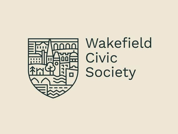
Wakefield Civic Society unveils new logo inspired by landmarks in the city


The new logo was created by Rhubarb Design House based at The Art House on Drury Lane. It will be displayed on the society’s documents and on its new website.
Society president Kevin Trickett said “When I was first elected as president in 2002, the Society spent some time thinking about what it did and how we could promote that to the public.
Advertisement
Hide AdAdvertisement
Hide Ad"We devised a brand for the Society which has served us well but it was beginning to look a bit stale and it needed updating so I was delighted when Rhubarb Design House first approached us with their offer and we are very pleased with the result.
"We have just updated our website and also launched a new Instagram account so the new brand will be found across all our sites, including Facebook and Twitter, as well as in our printed material.
"It’s really important for the Society to maintain a public profile that reflects the wide range of things we do and the interests we have.”
Rhubarb Design Agency was founded by Alex McIntosh and James Lodge. They have both lived in Wakefield nearly all their lives.
Advertisement
Hide AdAdvertisement
Hide AdJames said: "We have always been captivated by both the history and development of our wonderful city.
"We first encountered Kevin, and his passion for the city, on an Art Walk several years ago.
"Since then, it has always been in the back of our minds that we would one day like to join the society and have a hand in shaping the future of Wakefield.
“We launched our new design studio in the city last year and this seemed like the perfect time to join the society as corporate members and offer our design expertise.
Advertisement
Hide AdAdvertisement
Hide Ad"We were keen to help raise the profile of Wakefield Civic Society, as we are conscious that not everyone in the city is aware of who they are and what they do.
"They are a vital part in helping the city develop, which is something we both feel very passionate about.
“Late last year we broached the subject of a rebrand with the idea of creating a new logo which better reflected the society.
"Whilst the previous logo had sentimental meaning being based on one of the Society’s first ever restoration projects from the
Advertisement
Hide AdAdvertisement
Hide Ad1960s, it wasn’t obviously recognisable and didn’t really reflect the work of the society as a whole.
“The new logo aims to show the varied role that the society plays in the city. The shield shape hints at tradition, whereas the contemporary illustration style is clean
and ensures the logo stands out, especially in digital formats.
"We are absolutely thrilled with the outcome and hope that the new branding gains more exposure for the society and ultimately helps them attract new members!”